Book Review: Visual Design Solutions
Connie Malamed’s new book Visual Design Solutions: Principles and Creative Inspiration for Learning Professionals is written specifically for learning professionals. This book teaches many of the same foundational principles as other design books, but the examples and applications are all geared towards learning.
Connie Malamed’s new book Visual Design Solutions: Principles and Creative Inspiration for Learning Professionals is written specifically for learning professionals. As instructional designers, we often communicate visually as well as with text, audio, and other media. Many of us (myself included) don’t feel as strong about our graphic design skills as about our other instructional design skills. This book teaches many of the same foundational principles as other design books (including Connie’s first book, Visual Language for Designers
), but the examples and applications are all geared towards learning. If you’ve read visual design concepts elsewhere but struggled to apply them to your own learning design, this book is written for you.

Visual Design Solutions is divided into four major parts, each with multiple chapters:
- The Big Ideas (thinking and working like a designer)
- Building Blocks of Design (space and layouts, selecting images, and typography)
- Power Principles (color, visual hierarchy, unified design, contrast, and grouping)
- Practicing Design (directing attention, adding excitement, enhancing meaning, telling stories, and displaying data)
Each chapter is relatively short and filled with examples (as a visual design book should be). If you have read other books or articles on visual design, a fair amount of this will be familiar to you. Even someone with no background in graphic design (which, let’s face it, is most of us in the e-learning world) will be able to understand the ideas. I found myself repeatedly thinking, “Oh! I could apply this in my [Acme Widgets] course!” or “Why didn’t I ever see that before?”
In addition to the principles and examples, I appreciated how Connie explained why you might choose one style over another. For example, she says, “Use a symmetrical layout to achieve a restful and static design; use an asymmetrical layout for one that is more dynamic.”
What I Learned
I had a number of takeaways from the book, but here are two big ideas I’m still thinking about after finishing the book.
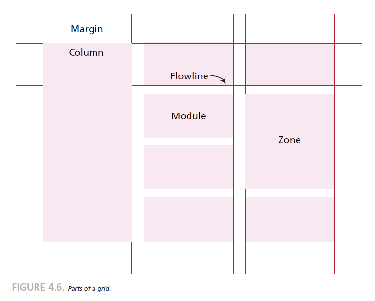
Chapter 4: Organizing Graphic Space included specific ideas on layouts for e-learning. This is one of the areas where I know I could do better, and the examples helped me figure out why I’m not always happy with my own layouts. I need to be more consistent about using a grid and guides to align content. Using a grid means I can keep everything aligned and unified across multiple screens. That means content like titles is where learners expect on each screen so they don’t have to waste brainpower trying to find the title instead of learning. Grids don’t have to be symmetrical; Connie shows multiple examples of grid-based layouts that aren’t just centering everything on the page. Connie also says, “In course design, we are always looking for ways to engage the learner. One way is through the element of surprise, which you can achieve through visual design. When it makes sense instructionally, such as to emphasize a key point or to show drama in a story, don’t hesitate to break the grid and use a wildly different approach, like placing elements on a diagonal orientation.”
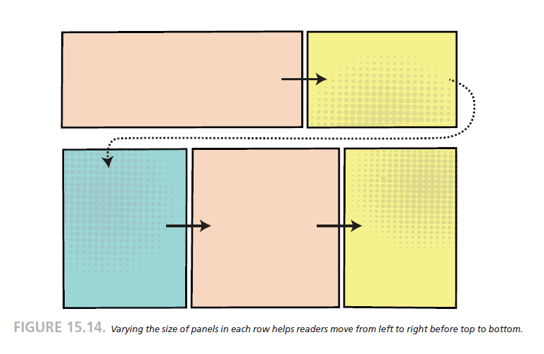
Chapter 15: Tell Stories With Visuals was especially interesting to me because I use storytelling techniques so often in my courses. I do almost all of my storytelling with words though, and this chapter challenged me to think about ways I could enhance my stories with better visuals. Some of the advice here was very concrete, such as thinking about how to lay out panels so it’s clear to learners which way to read. If your panels and gutters are all the same size, they line up in a grid and it’s harder to know if you should read vertically or horizontally first. Using narrow vertical gutters and wide horizontal gutters, as well as varying the widths of panels, makes the flow of reading clearer. This is a really simple idea, but it makes perfect sense. It’s something I can easily apply.
A Few Mild Criticisms
I have an electronic version of the book, and I think I would have enjoyed a print version more. I tend to buy physical books for my reference texts (as this book will be). Some of that is personal preference, but I think with such a visual book it might be more effective to see it printed on the page. Then again, these examples are designed for viewing on screens. If you’re normally a Kindle person, don’t let this stop you, but if you’re not sure, I’d go with the print version. (Update: Because Connie is a wonderful, generous person, she shipped me a physical copy. The book is beautiful in print, and it strengthened my view that this book is best when you can physically hold it.)
Because the book contains so many images, sometimes the images are on a different page than the text describing the concept. In the physical copy, it’s easier for me to flip back and forth between pages, plus you’re looking at two pages at once instead of one.
The book contains a lot of jargon. It’s necessary to have the specific words to discuss these issues and not be haphazard in design, so I know learning the words is important. All of the terminology is explained clearly. However, in a few places in the book, there’s just so much vocabulary at once that I found myself reading very slowly and rereading to understand it all. I don’t think that’s a problem with Connie’s writing so much as just an acknowledgement that visual design is a huge field with its own language. If you haven’t done much reading or studying in visual design previously, you may find you can really only absorb one or two chapters at a time. Spacing it out is likely more effective for learning it all than trying to read it all in one sitting anyway.
I kind of wish there was a concluding chapter at the end. I got to the end of the last chapter and literally said, “Wait, was that it?” A short recap would have helped remind me of all the principles, even if it was mostly restating the key takeaways from the end of each chapter.
Recommendation: Buy It!
Overall, I found Visual Design Solutions very helpful, and I will be coming back to it and rereading it again in the future. I recommend it for any instructional designer or e-learning developer who feels they could be stronger in visual design.
This post contains affiliate links. It doesn’t cost you anything extra, but I earn a small percentage when you buy through these links.
Thank you for reviewing this book, Christy; I find your observations very helpful and will definitely buy it.
Thanks for reviewing my book, Christy! You’re right, I think it is a lot to take in all at once. In fact, I’m hoping some professors will use it in their multimedia ID courses, perhaps one chapter a week. One thing is for sure, getting better at visual design skills never ends. You have to just keep practicing and gaining more awareness of design to keep improving.
Best,
Connie
Yes, your book would work well for a semester course. One chapter a week, with practice activities related to each chapter, would be a very effective way to read the book and really learn the concepts. This isn’t a book you can sit down and read in an afternoon if you want to really absorb it all. This is much more of a tool for continuous learning than a “one and done” resource.